2014 Was Amazeballs for Katherine Elizabeth Events (Here are my faves)
Wow, we're more than a week into 2015! As I close the books on 2014, I can't help but be so thankful for this new life I'm living. In March 2014, I officially stopped working 40 hours a week for someone else, and started a new life as a business owner. And I couldn't be happier. Engagement season has been very good to me again this year; newly engaged brides and grooms are flocking, and I'm looking forward to a busy spring 2015!
It's natural at the end of the year to look back on the bests and worsts of the previous year, and I can proudly say there are way more bests than worsts! I thought I'd highlight some of my favorite wedding suites from 2014:
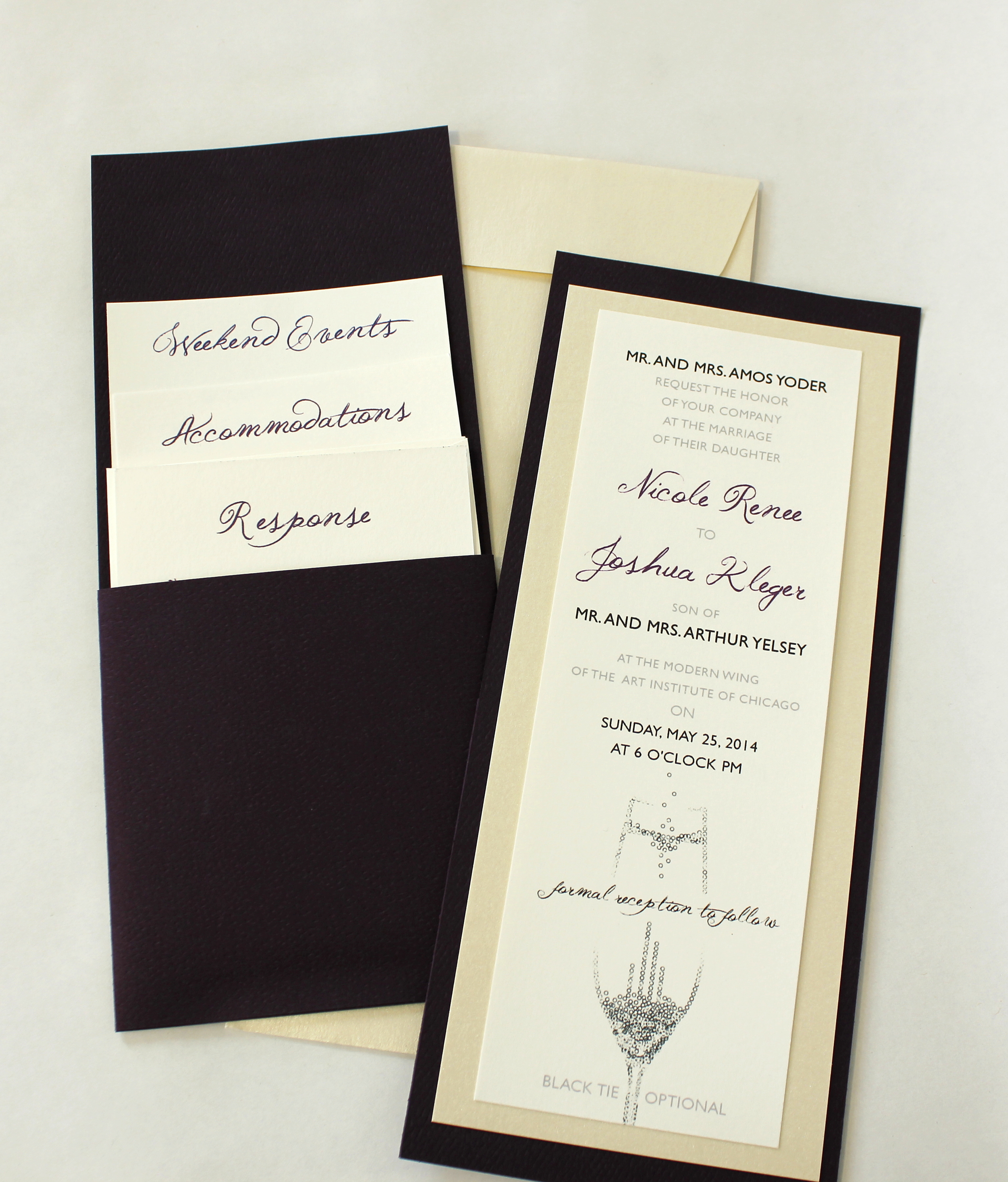
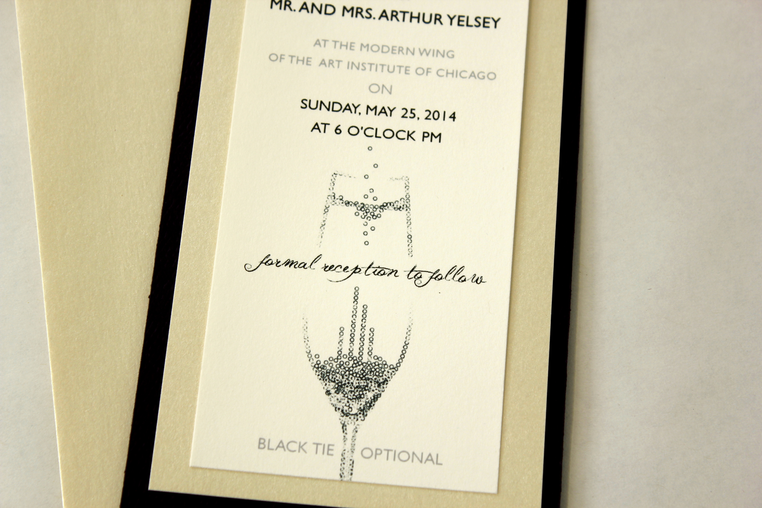
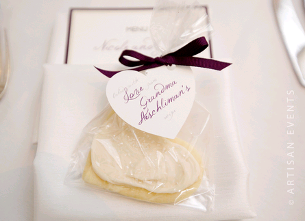
Nicole and Josh As 2014 started, the work on Nicole and Josh's invitations was already in full swing. I had met her at a cocktail party in Fall 2013 and had shared with her how I was trying to make this whole thing a business. We went on a double date a few weeks later, and while the guys talked business (or sports?), we talked wedding invitations. By the end of the conversation, I learned that food and drink was a huge part of Nicole and Josh's relationship (shocking that we get along, right?). Clinking flutes of champagne is a favorite pastime for the couple, and she told me glasses of bubbles were a must for the black tie reception. We dug a little deeper, and I suggested a whole champagne bubble theme. I started with the flute itself, building it out of tiny circles, and once Nicole saw that piece, I was given the go-ahead for the Chicago skyline. This was truly a labor of love. Including a few technical difficulties (I lost my work TWICE during the process!) the skyline took me about 3 hours to finish. Personally, I think the results were worth it, and we used it again on their ceremony programs! Nicole also had me do menus and gift tags to complete the suite. Artisan Events photographed the wedding--check out their work and Nicole and Josh's big day here. And congrats you two!
Jen and Andy I got my start in this business by working with friends and family (Thanks Annie, Kaylin and Kerry!) and working with a good friend always brings me back to my roots and reminds me (as if I could forget) how lucky I am to do this for a living. When Jen approached me to do her invitations, I was so excited. Jen might be the coolest person I know (no offense to everyone else I know). But seriously, the girl just oozes cool, and most women want to be her. And Andy? No question his coolness matches hers. SO, no pressure, right? Well, I have to say, their invitation came out pretty damn cool. Jen was planning a wedding a midst the tall New Hampshire pine trees under which we grew up together. But the couple lives a rockstar life (no, really, Andy's a touring musician) in Denver. Jen told me she wanted to somehow combine their life in Denver with the rustic woodsy feel of their campy barn wedding. No problem! Both Jen and Andy are artists, musicians, and Jen is a fellow dancer. Music plays a huge roll in their lives and their relationship, so I thought, why not use that? The photo for the record cover had the feeling we needed; a little of their edgy style set in a grassy park. With a few whimsical fonts and splashes of red, I think this successfully screams "rockstar rustic". Congrats my loves!
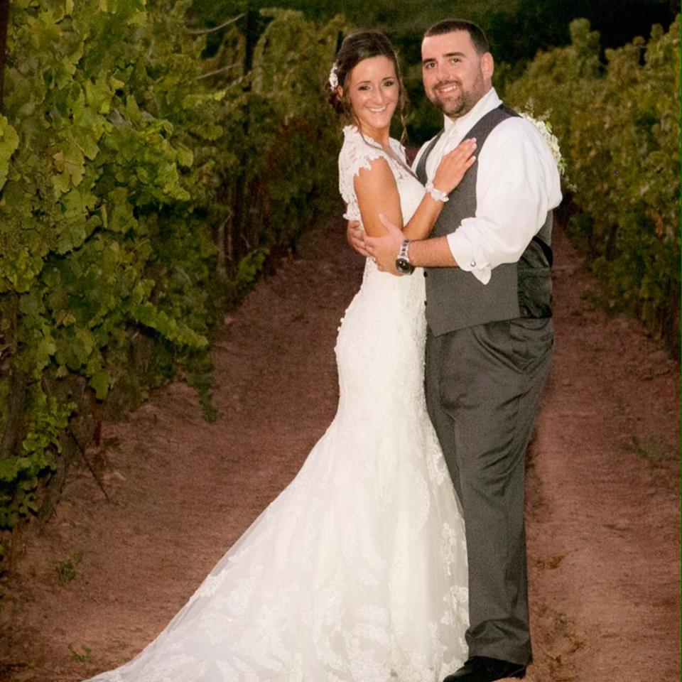
Fred and Krista Freddy and my husband have been life-long best friends, so when his bride to be asked me about invitations it was a no-brainer than I was available and on-board! Their wedding was set for May 25 at a winery in the hills of Eastern Pennsylvania, and Krista described the wedding style as elegant with a little rustic burlap and lace, and deep purple and ivory for the colors. We went through lots of drafts to nail down the right feel for the lace on the invitation--light and airy with an antique tone is how I'd describe what we settled on. Fred and Krista had an extremely difficult May, with some major health issues and a few real life-threatening moments that ended up forcing them to postpone the main event to the fall. On a beautiful Sunday afternoon in September, the healthy bride and groom recited some of the most powerful vows I've ever heard (yes, I was there!) under a setting sun, and I can confidently say the two will definitely live happily ever after. Krista asked me to do place cards, table numbers and bar menus to complete the suite. What a gorgeous wedding!
Sara and Drew Sara came to me last summer to do invitations for her fall wedding on the shores of the Chesapeake Bay. Her wedding was to be an outdoor affair in mid-October, and she described the feel as "rustic elegance" with red/orange/gold tones and the men in Wallace plaid ties. She suggested using images of the nearby lighthouse, the blue heron, and a crab; all distinctly Maryland icons. I was inspired and I dug a little deeper and read Sara and Drew's engagement story on their wedding website. I was in tears when I read that Drew had proposed on the bridge that was built for and named after her late father (an old friend of my Dad) and I knew I had to find a way to incorporate an image of that bridge. After lots of tries at digitally drawing the images, I decided to Keep It Simple Stupid and pulled out my sketchbook. The pencil drawings really brought the whole thing home for me, and brought a rustic feel to an otherwise purely elegant invitation suite. After the invitations were sent, Sara came back with requests for gift tags (stickers, actually), table numbers, menus, ceremony programs and place cards. Photos by Krista A. Jones Overall, 2014 was good to me, with lots of inspiring brides (and grooms) and enough work to push me out of the nest and onto my own. I am so thankful for everyone who has entrusted me with these important pieces of their most important day, and I am already looking forward to a 2015 full of much more! Some of you may be asking, What about the biggest event of your year, your own wedding?! Well, that deserves its very own post, don't you think?
